Photo by Photo by Bruno Nascimento on Unsplash
7 Minute Read
Overview: Site re-design for Mary's Place to encourage donor engagement
School of Visual Concepts, Fall Capstone project
School of Visual Concepts, Fall Capstone project
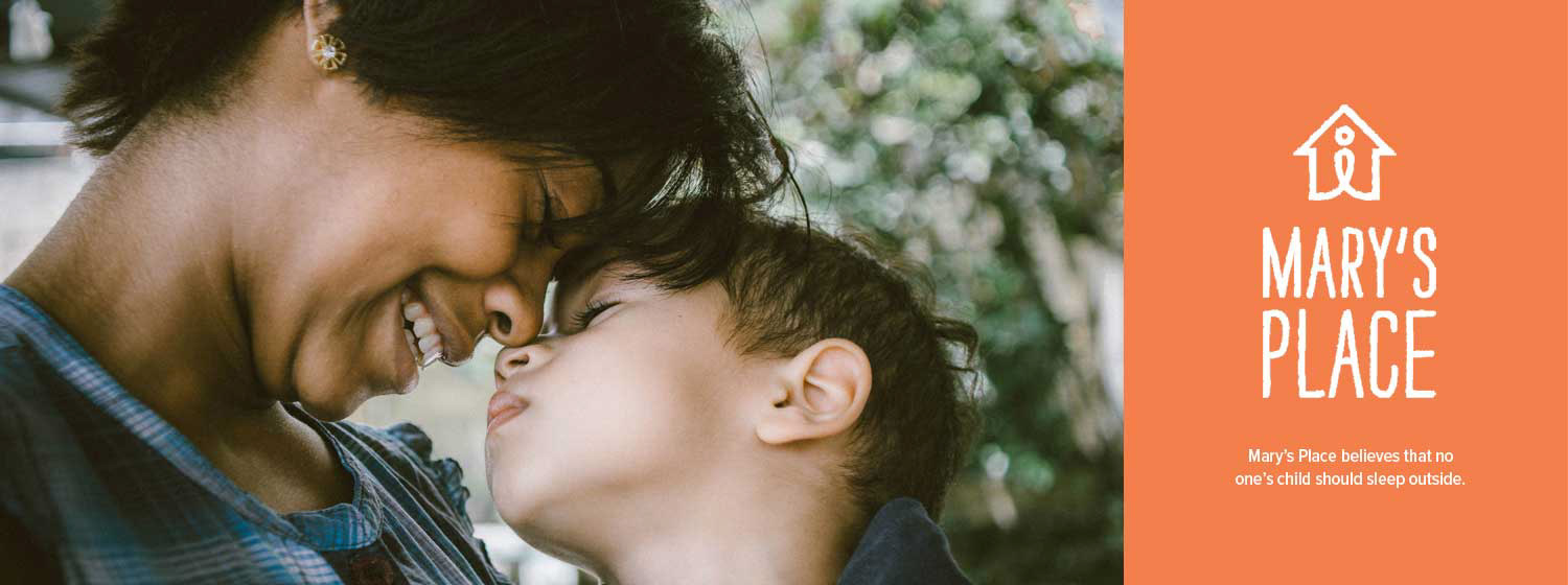
Client: Mary's Place
Sector: Non-Profit
Project Length: 10 weeks
Team: 5 UX Students
Sector: Non-Profit
Project Length: 10 weeks
Team: 5 UX Students
My Role:
• Research & discovery
• Design sketching
• Wireframes and Prototypes
• Presentation
• Research & discovery
• Design sketching
• Wireframes and Prototypes
• Presentation
According to a recent article in the Seattle Times, Seattle has the third-largest population of homeless people in the country. With rents at an all time high in this tech hub, the situation continues to get worse. Mary’s Place came to us for a site redesign after the announcement that Amazon would donate more than 47,000 square feet of space in their headquarters as a permanent location for a Mary’s Place Shelter.
Mary’s Place has been a voice for homeless women, children, and families since 1999. The current website was designed in 2013, but does not support the organization well. It's not easy to navigate, and doesn’t offer a straight forward path to donate. The assignment was to create a site that would raise awareness and increase support.

Our solution for Mary's Place
APPROACH:
Seeing homelessness on a daily basis, I wanted to do whatever I could to make a difference. An improved site design would have a tremendous impact on the organization and its mission.
The main objectives were to:
• Update the design
• Improve ease of use
• Develop a responsive solution
• Create a strong call to action
• Update the design
• Improve ease of use
• Develop a responsive solution
• Create a strong call to action
A user-centered design approach provided a solid framework to the process.
RESEARCH:
The team set out to develop a deeper understanding of Mary's Place beyond the creative brief. The process included a site tour, a survey of giving habits, and other research. How did donors and volunteers contribute to the success of the organization? That's was the question to answer before moving forward in the process.
The tour of Mary's Place primary location made a big emotional impact. We saw first hand how the importance of financial and volunteer support helped them. We saw a welcoming, safe space that provided shelter. Guests could access meals, medical care, educational places for children and much more.
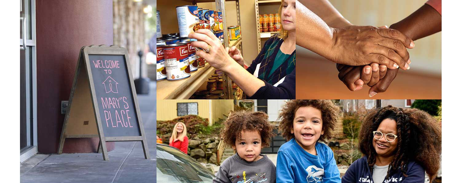
Mary's Place in The Regrade, near their new home in the Amazon Headquarters
Secondary research highlighted the perplexity of the homelessness situation in King County. Organizations like Mary's Place are an important part of the solution.
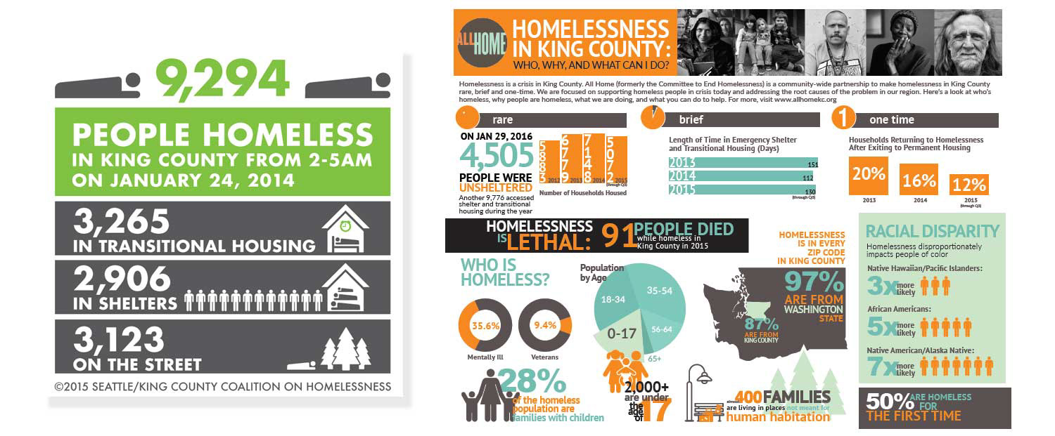
Statistics on Homelessness from King County
The current donation path on Mary’s Place site was quite a challenge. I explored competitor’s sites to see what an improved donation experience looks like.
I also identified an upcoming fundraising luncheon for a similar organization. It was a way to learn about what inspires people to donate first hand.
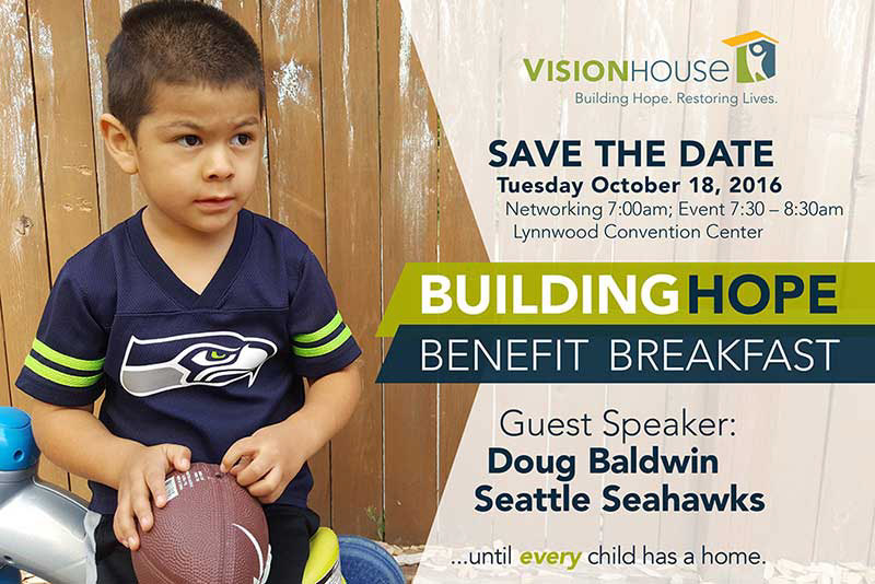
An opportunity to attend a luncheon for Vision House to learn about donation practices
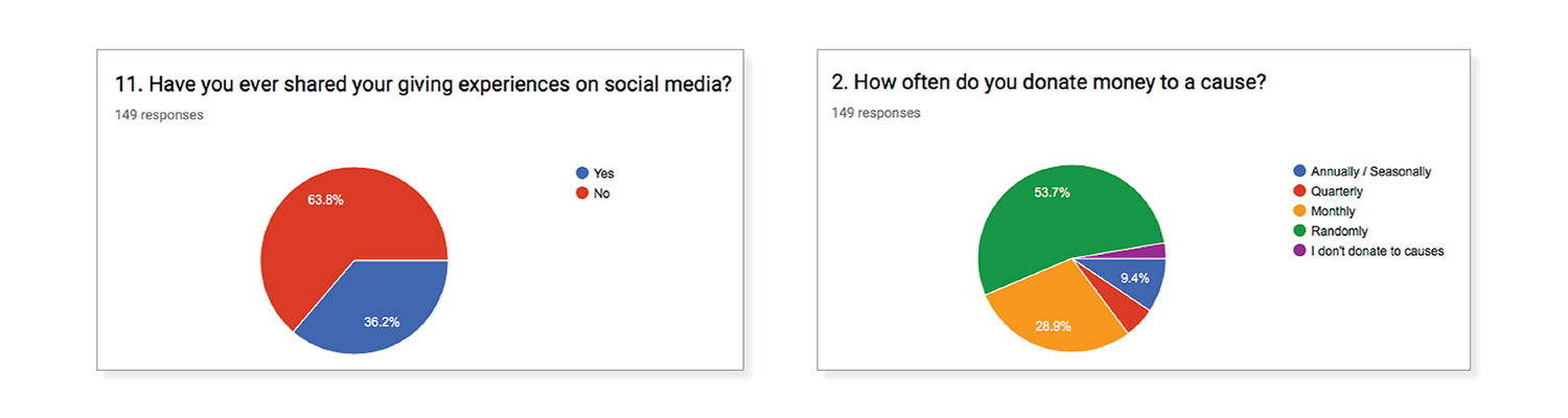
An online survey provided a look into the habits of our peers when it comes to donating and volunteering.
Some questions arose.
Some questions arose.
The survey revealed 3 main findings:
• Volunteering was not a regular habit: How might we increase participation?
• Donors don't often share their giving experience on social media
We learned from the luncheon that this an important tool, it led to more awareness about the cause and increased participation. How might we increase sharing?
We learned from the luncheon that this an important tool, it led to more awareness about the cause and increased participation. How might we increase sharing?
• Donors were not familiar with AmazonPay: How might we educate the donor about using this tool?
DISCOVERY:
The research revealed that people felt good about their service and donations. It made them grateful for what they have, and appreciative that they can serve others. There was also a strong belief that giving back helped make the community stronger.
An opportunity statement started to take shape:
“How might we create an exciting and informed experience for people interested in giving back?”
For starters, showcase the impact Mary's Place has on the community. Communicate the stories of guest, the services provided and create an emotional narrative. The donor becomes part of the story and part of the solution.
Visual Thinking:
With the research in mind, I worked on paper to summarize key findings, and sketched user flows and ideas. Then we voted on what solutions might be best to move forward with low-fidelity mockups.
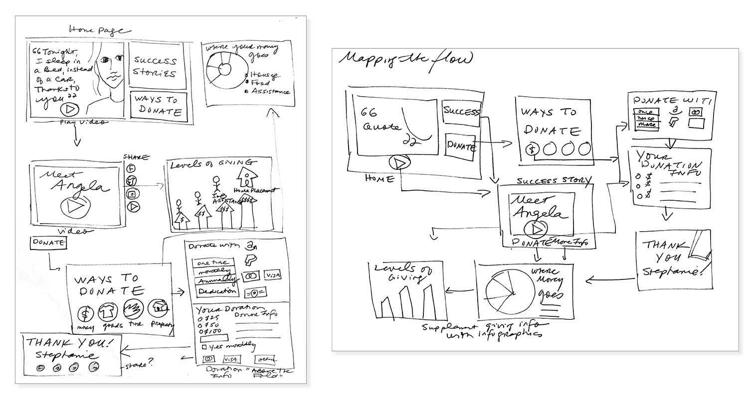
Mapping user flows through sketches.
PROTOTYPING & TESTING:
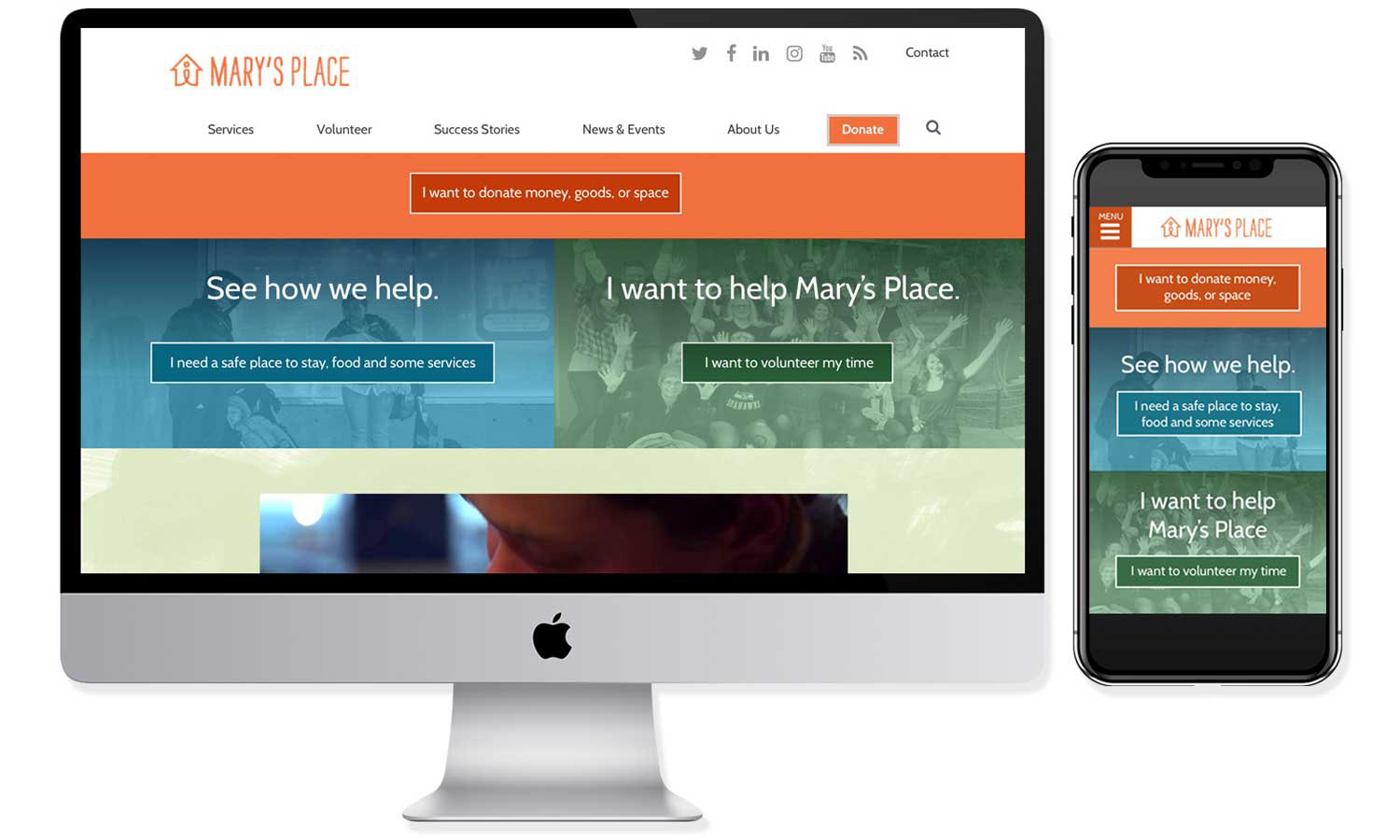
On the homepage, the strongest direction was to separate the two areas of information: “I need help” to “I want to help”. It was important to inform the user with the mission statement front and center. Statistics on homelessness in King County created emotional impact for the viewer. Upcoming events further engaged the viewer.
Based on the research, users of the site would either be going to learn more aboutMary’s Place, or to contribute.
On the "I want to help" page, areas of giving fell into 6 categories. Testing revealed that donation of money should take priority in the order. Showcasing the fundraising goals inspired the donor. Success stories of the guests reinforced the importance of giving.
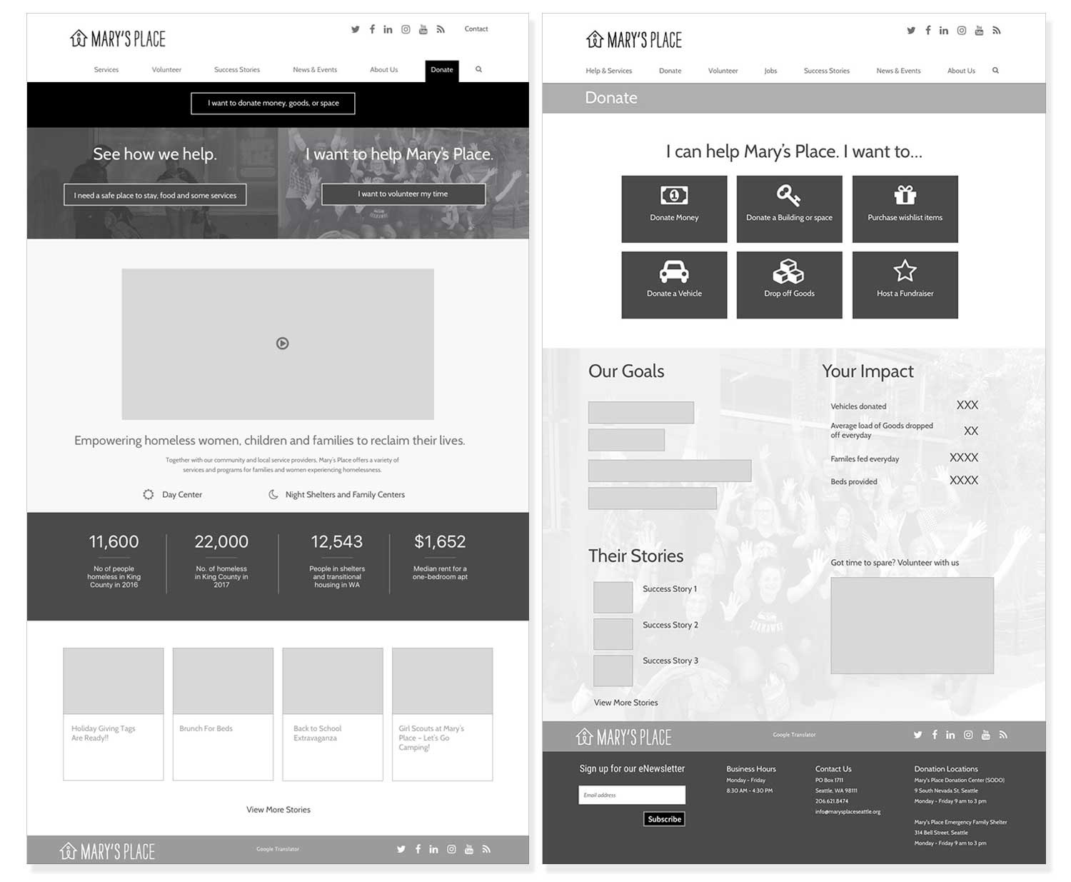
Medium fidelity prototypes for testing
After further iteration, we ran usability tests with 6 participants. I sought to find common themes among the participants as I distilled the results of the testing. This lead to further iteration and development of the prototypes.
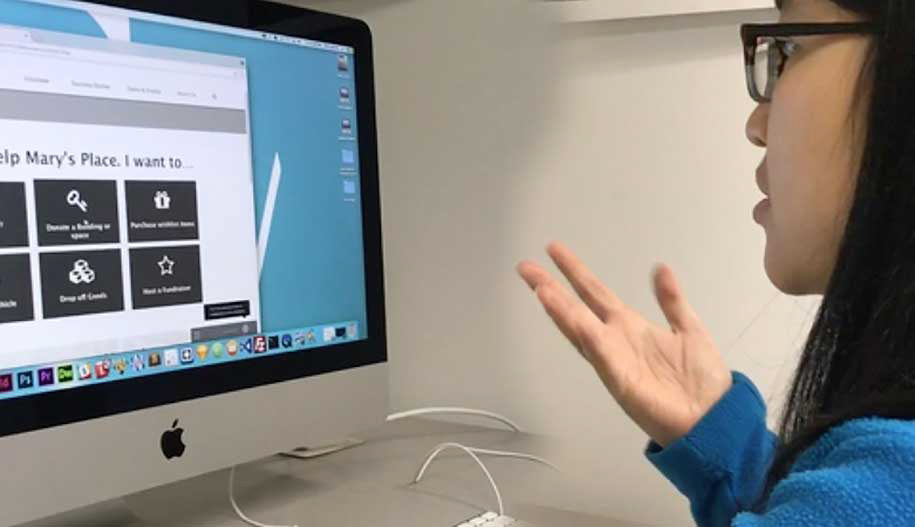
Usability tests were conducted of a live prototype
Takeaways
Some language was confusing on the homepage
The donate button wasn't standing out
Still needed to simplify the donation process
The donate button wasn't standing out
Still needed to simplify the donation process
The meaning of “Beds and Services” and "I Need Help" wasn’t clear, inclusive language. A lightbulb went off for me to say “See How We Help” instead. This simple tweak offered a solution for both guests of Mary’s Place, and for the organization itself. More work needed to be done in order to highlight the donation button and create a morestraightforward process to donation.
SOLUTION:
High Fidelity Prototypes:
https://projects.invisionapp.com/share/5SECIHOHR#/screens
https://projects.invisionapp.com/share/5SECIHOHR#/screens
After testing and iterating, we designed a color solution for desktop and mobile.
SUMMARY:
Mary’s Place wants to end homelessness in King County. They need to inspire the community to offer financial support, time and talent. The solution presents a strong direction for moving forward. It offers an improved design, a clear call to action and simpler path to donation. Viewers believe that they can be part of the solution to end homelessness with Mary's Place.
©Anne Dixon 2018