Photo by Photo by William White on Unsplash
3 Minute Read
Overview: Web UI design for Music Fest and Summit
School of Visual Concepts
School of Visual Concepts
Client: Upstream Music Fest + Summit
Sector: Arts and Entertainment
Project Length: 10 weeks
Team: Solo
Sector: Arts and Entertainment
Project Length: 10 weeks
Team: Solo
My Role:
• Visual Design (UI)
• Research
• Site Map
• Wire Frames
• Presentation
• Visual Design (UI)
• Research
• Site Map
• Wire Frames
• Presentation
Upstream Music Fest and Summit debuted in May of 2017. Seattle has a compelling music history. The founders wanted to celebrate the sound of the region. But the fest needed to be different than the others.
They wanted to be a catalyst for emergent music and culture in Seattle. My assignment was to reimagine the current visual design for the website.
The key goals were to:
• Keep visitors informed and create excitement about the festival
• Promote sign-up for updates and new
• Drive ticket sales
• Promote sign-up for updates and new
• Drive ticket sales
My solution for Upstream Music Fest + Summit
APPROACH:
Upstream provided a comprehensive brand guide and creative brief. Their mission statement focused on emerging artists and the new music economy. The final solution needed to help the festival stand out among its competitors. And it needed to help create a sense of belonging and excitement about the music for the audience.
Being a music fan, the secondary research was effortless. I found out more about competing music festivals and conferences.
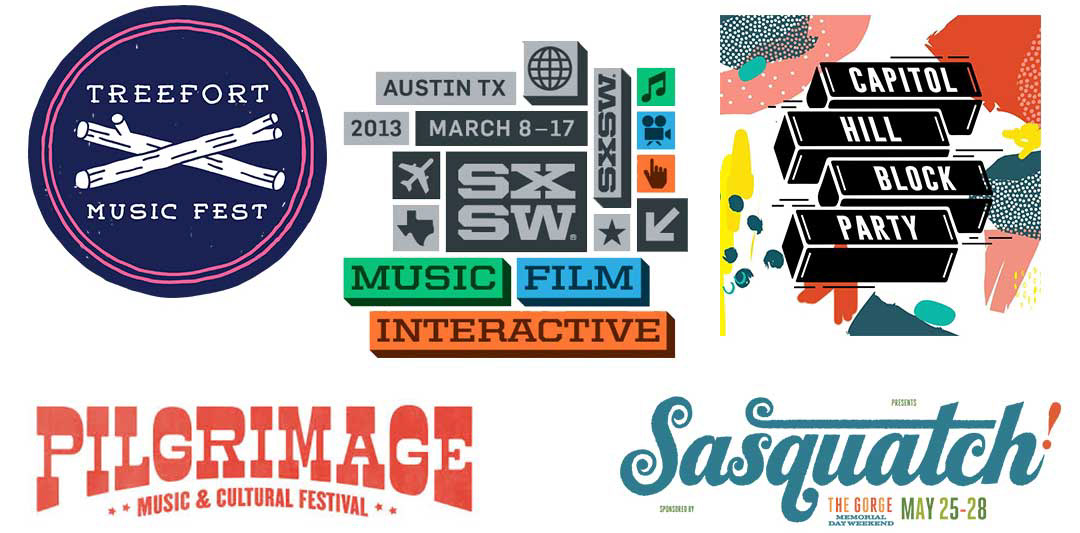
So many competing music festivals!
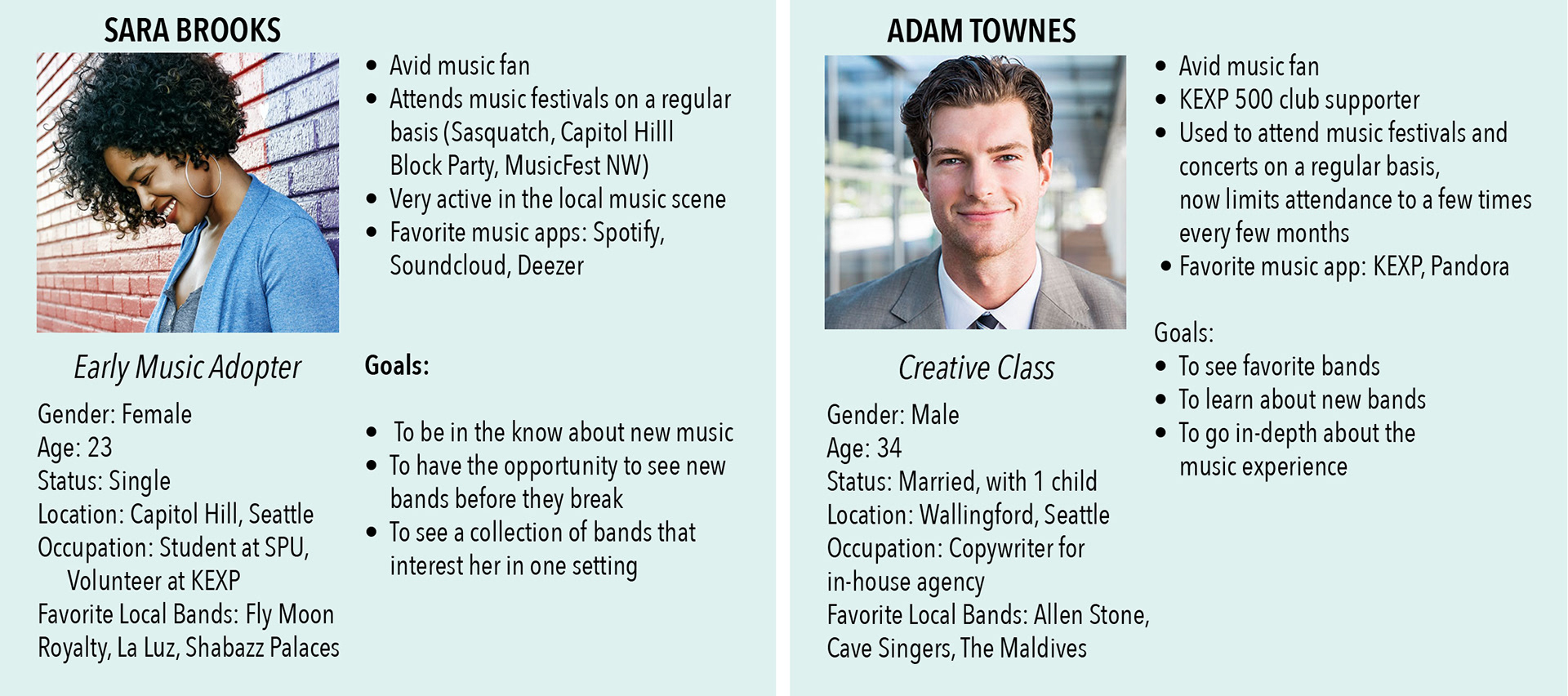
I created two personas based on the profiles that the Stakeholder had provided: “Early Music Adopters” and “Creative Class”.
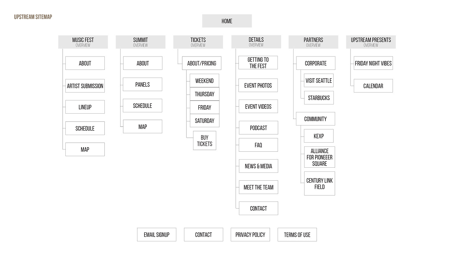
I created a sitemap to give my concepts a solid foundation to build upon:
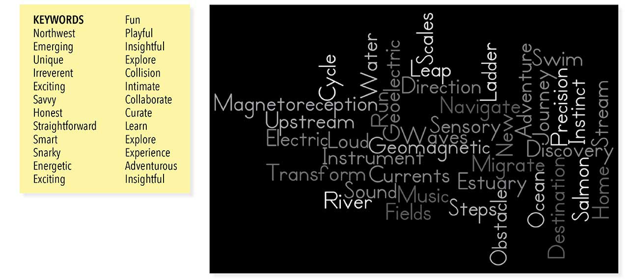
I utilized a mind-mapping exercise. It’s a way to generate ideas based on words that may seem unrelated, but converge to create an idea/solution
Some strong themes developed during my research, and I came up with two concepts:
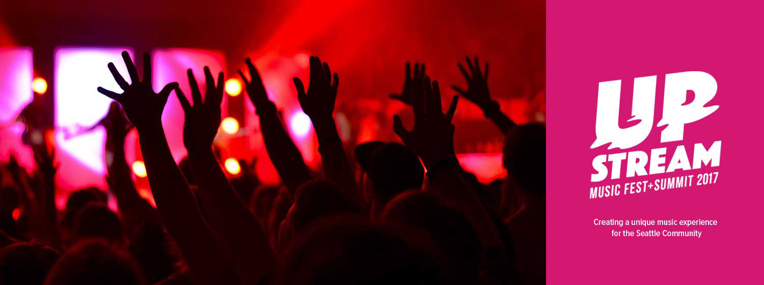
Concept 1 – WaveForm: The Waveform is ever present in the world of music.
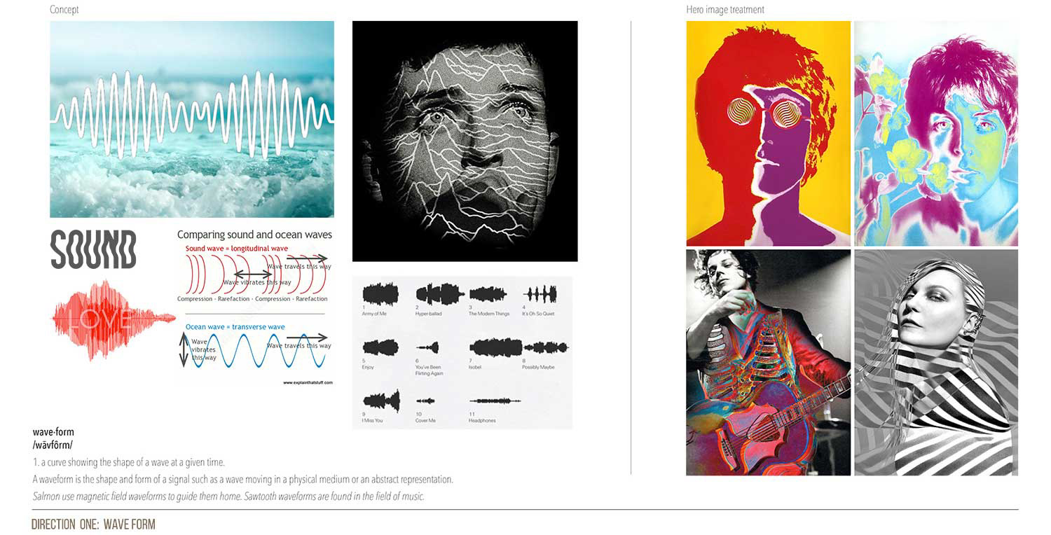
Moodboard: I wanted to infuse the idea that sound, movement, and energy was the essence of the festival.
Style Board: I used this to evoke the feeling of the project (color palette, design, layout, etc). This was a tool to present the web styles and give a sense of how the site will maintain the concept throughout.
Concept 2 – Journey: I thought of the journey a music festival goer might take to arrive in Seattle.
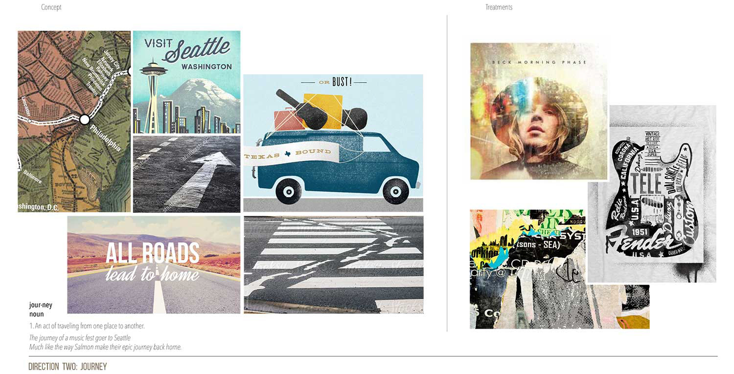
Moodboard: Has a more “maker-like feel”, with rough-hewn, crafted imagery and textures. Much like a weathered map, or the sites you’d see at a roadside attraction on a trip.
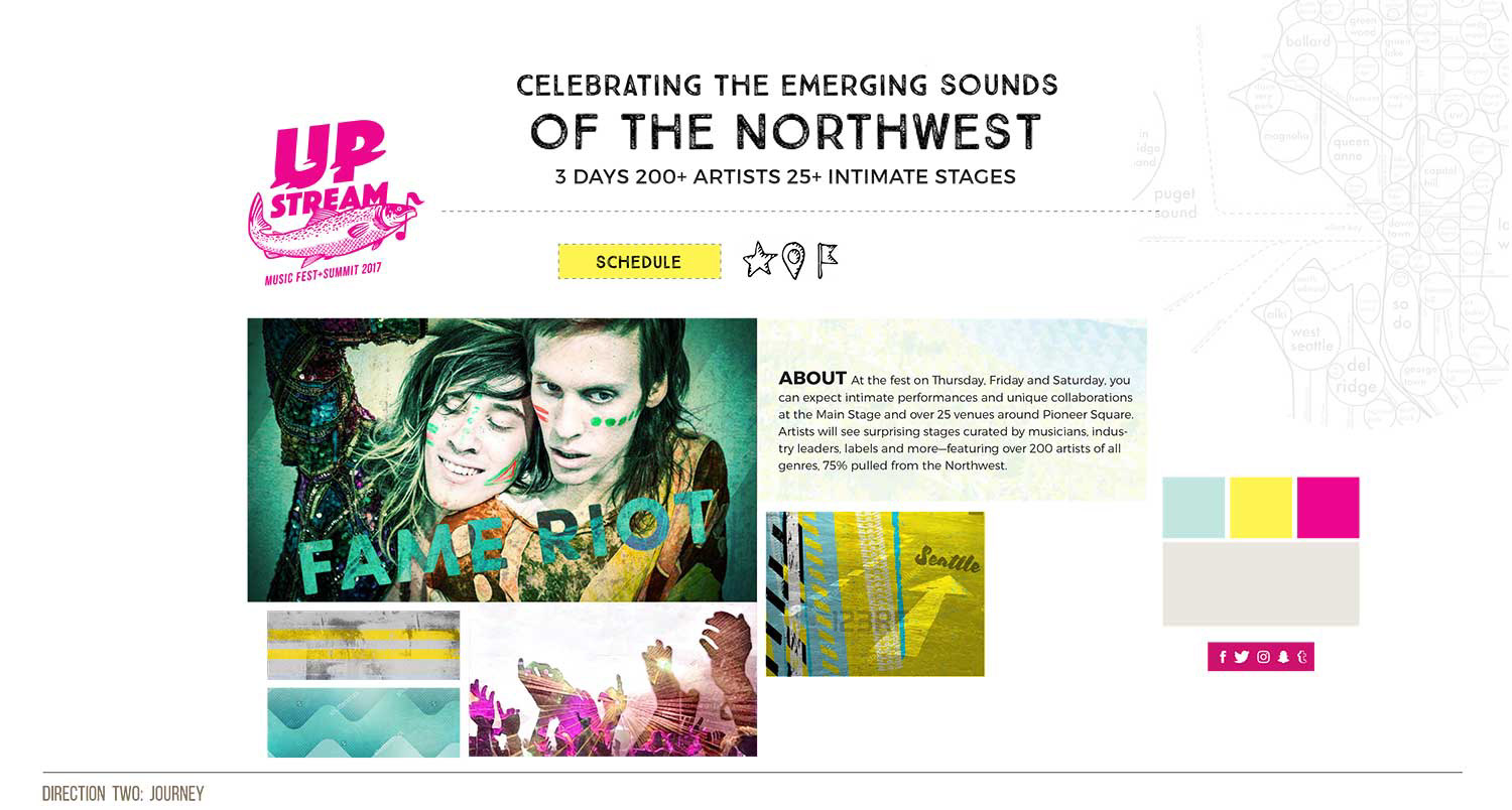
Style Board: I used this to evoke the feeling of the project (color palette, design, layout, etc). This was a tool to present the web styles and give a sense of how the site will maintain the concept throughout.
SOLUTION:
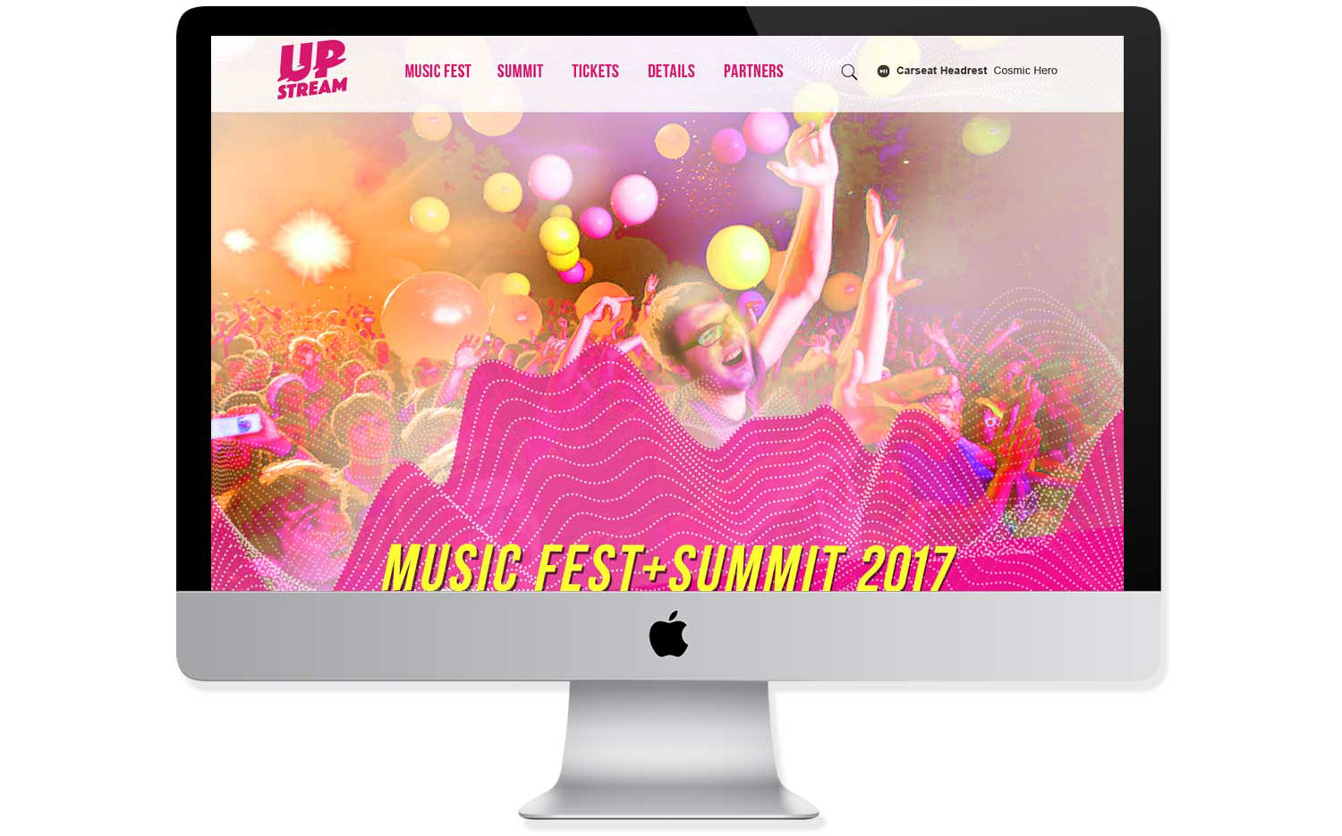
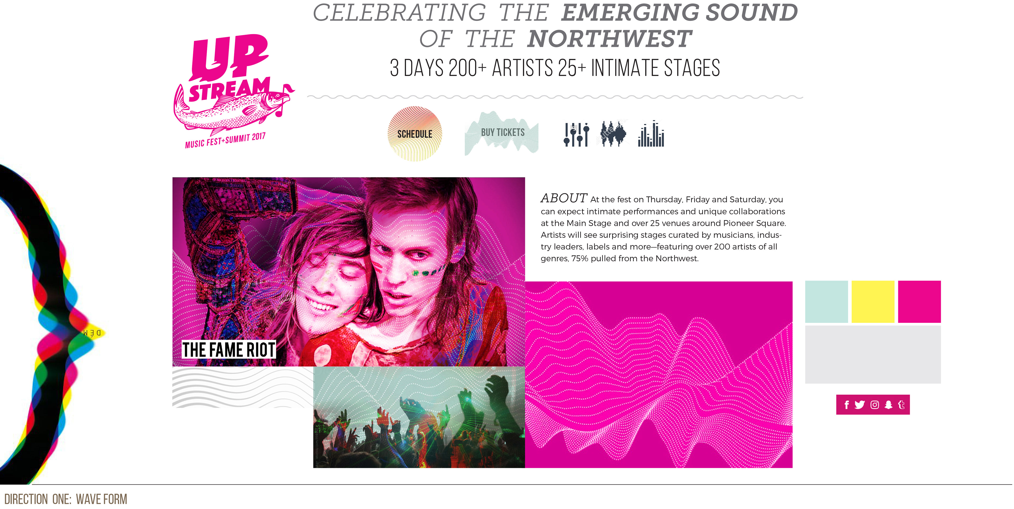
I developed further developed the two concepts, and chose to refine and present "WaveForm":
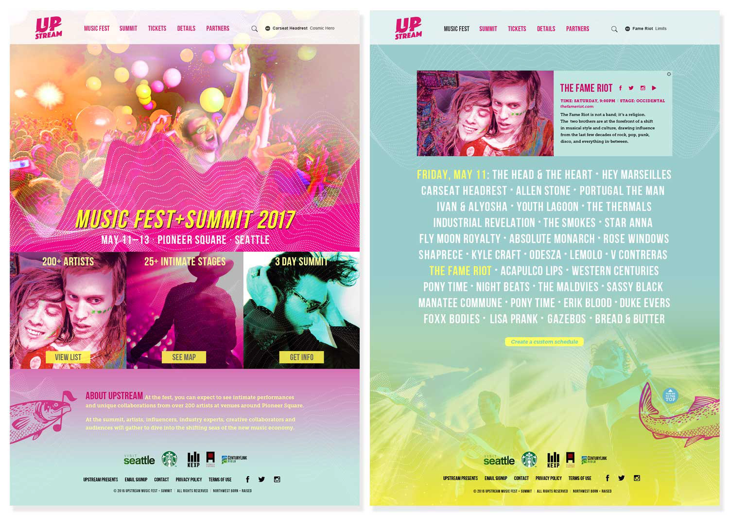
WaveForm: Home Page (L) and WaveForm: Secondary Page (R)
©Anne Dixon 2018