3 Minute Read
Overview: Site re-design (Sponsored by UX Design Contest)
Client: San Francisco Zoo
Project Length: 12 days
Team: Solo
Client: San Francisco Zoo
Project Length: 12 days
Team: Solo
My Role:
• Research & discovery
• Design sketching
• Wireframes and Prototypes
• User Testing
• Research & discovery
• Design sketching
• Wireframes and Prototypes
• User Testing
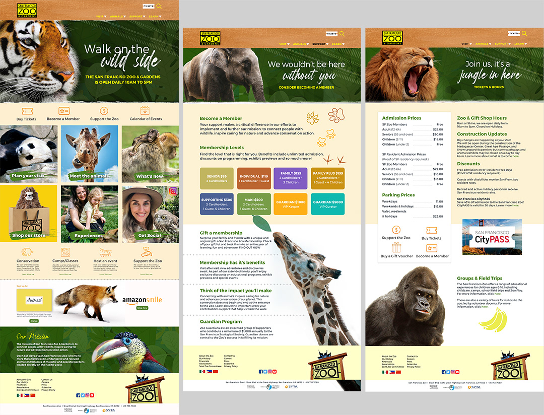
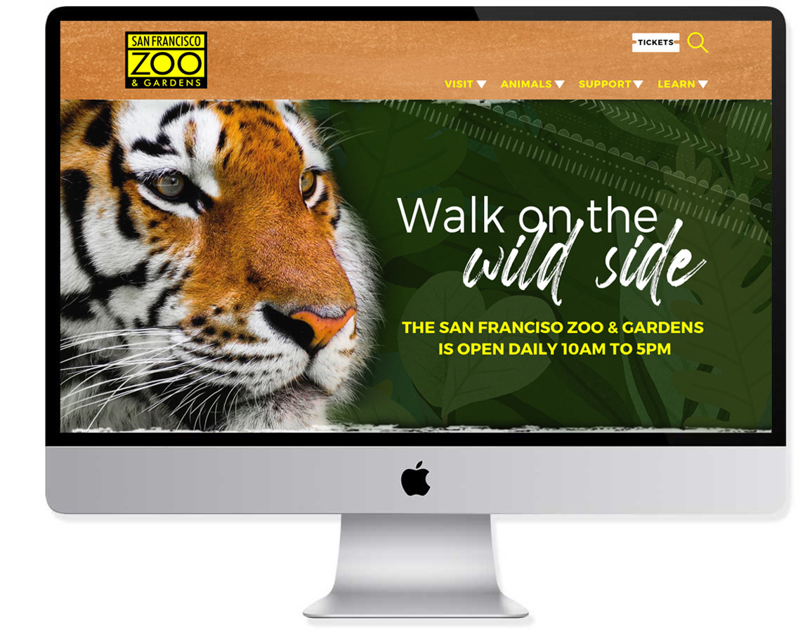
The assignment was to give the San Francisco Zoo website a visual design refresh. This would be achieved by defining a new design language and applying the four attributes of good design (Contrast, Repetition, Alignment and Proximity). I selected three pages: Home, Member and Tickets to redesign.

My solution for The San Francisco Zoo
RESEARCH:
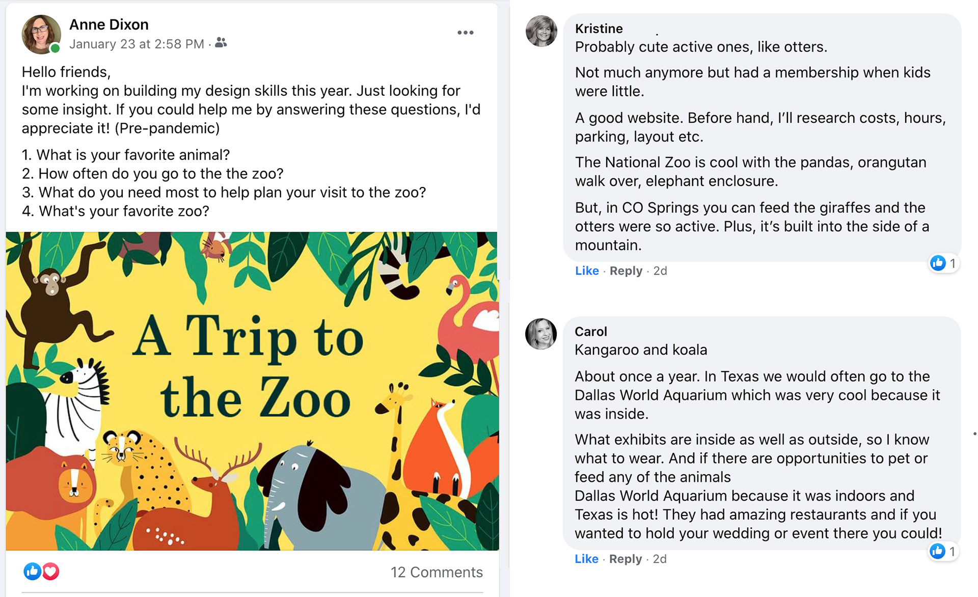
To begin the exercise, I reviewed other zoo sites for inspiration. I read about the top ten animals at the zoo. For fun, I watched the movie "We Bought A Zoo". In addition I did a brief Facebook survey among friends to gather their thoughts:
Who’s the user? A parent who wants to plan a trip to the zoo with their family
What’s the user story? I want to find information on the zoo, so that I can successfully plan a trip to the zoo.
User Journey: A parent goes to site, (maybe with a child on their lap). The child is drawn to the wonderful, colorful images of animals. And the parent is inspired by their kids’ reactions to look for pertinent info to plan their trip, find out hours, ticket prices and perhaps join as a member. They navigate through each section on the home page, and then click on ticket prices to get more information. After reviewing the calendar, tickets are purchased. They also click on the membership tab with interest to support the zoo. They decide to consider a membership at a later time, perhaps sharing the information with other parents.
The Tickets/Hours page had an overabundance of copy, and it was not very clear or interesting. There was very little color or arrangement to make the information palatable for the audience. There were spacing issues within copy blocks as well. The Membership page had more visual interest, yet it needed to utilize some of the design principles to add visual interest and clarity.
PROTOTYPING & TESTING:
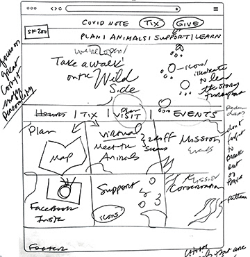
I took pen to paper before I created prototypes.
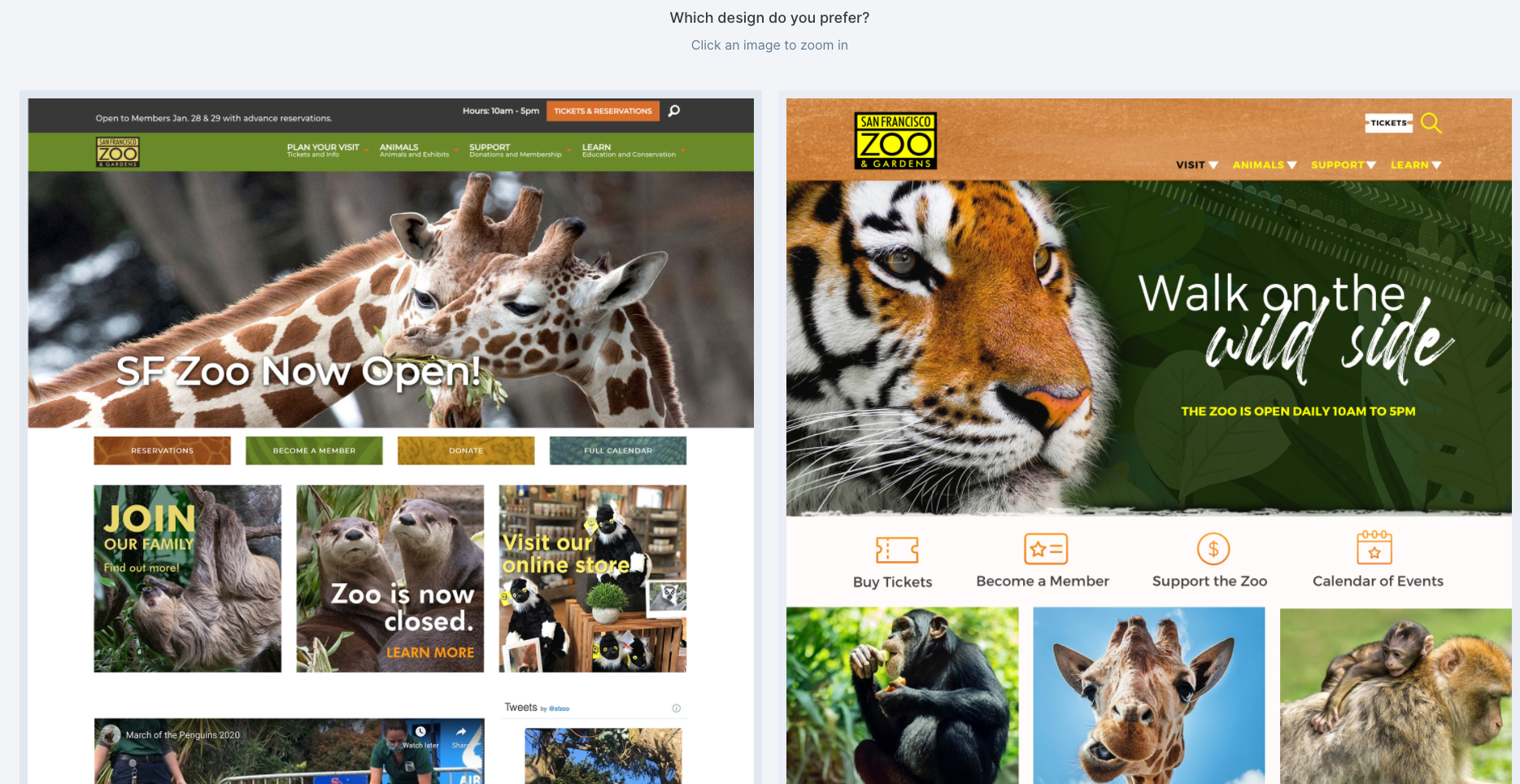
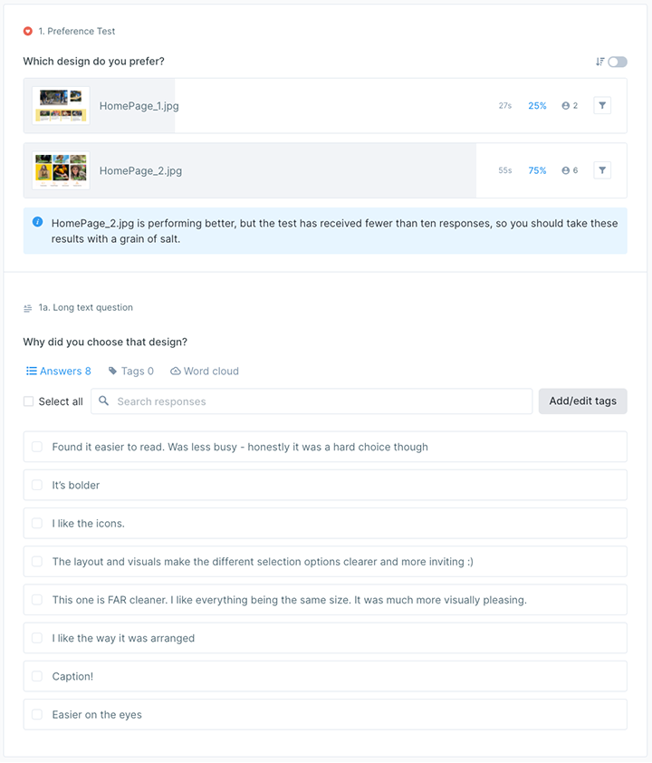
I tested the existing homepage (Design #1) against mine (Design #2) utilizing a comparison test at UsabilityHub:
SOLUTION:
SUMMARY:
My goal was to practice the four attributes of good design to improve the legibility and interest of the site. I wanted to create stronger calls to action, and bring a greater degree of interest upon the initial visit and encourage repeat visits to the site. Thanks to UX Design Contest for the opportunity to build my design skills!
©Anne Dixon 2021